I just posted an article on the ground-breaking ESCAPE trial in ischemic stroke on the Calgary Herald.
Dynamic infographics are a simple but powerful tool to communicate complicated medical information – like clinical trial data – to patients and their families in an intuitive manner. Here are a couple of infographics that summarize the remarkable results of the ESCAPE trial of Endovascular Therapy:
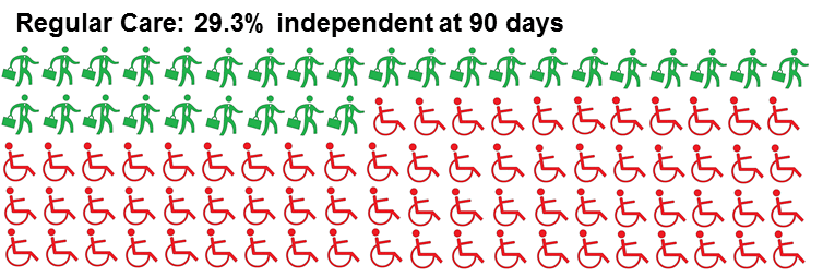
The ESCAPE Trial showed that patients were far more likely to be independent for their daily activities at 3 months if they received endovascular treatment for their stroke. Source icons originally designed by Carlos Dias and Wilson Joseph of the Noun Project.
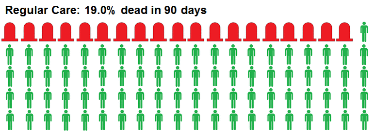
The ESCAPE Trial also showed that patients were less likely to die in 3 months if they received endovascular treatment. Source icons are in the public domain at the Noun Project.
As you can see, simple pictures like this – vs the graphs we typically use in academia – can help people quickly recognize the benefit of a proposed new treatment and think about costs vs gains more intuitively.
Interested readers can check out the full text of the ESCAPE trial in the New England Journal of Medicine.
Until next time,
Aravind Ganesh MD
Co-founder, SnapDx